I was invited to join the Postmodern team as a freelance Art Director and CG Generalist to develop the opening titles sequence for the Ukrainian feature film The Witch: Revenge.
This project marked my first experience working within a full-scale film production environment. I was given a strong level of creative freedom, which allowed me to shape the visual direction and craft a sequence that supports the film’s atmosphere and tone.
The process was dynamic and collaborative, and it was incredibly rewarding to see the final result on the big screen. Being part of a cinematic production in this capacity was both a meaningful milestone and a valuable creative experience.
All rights reserved by Postmodern and Film.ua.
Styleframes
R&D Process
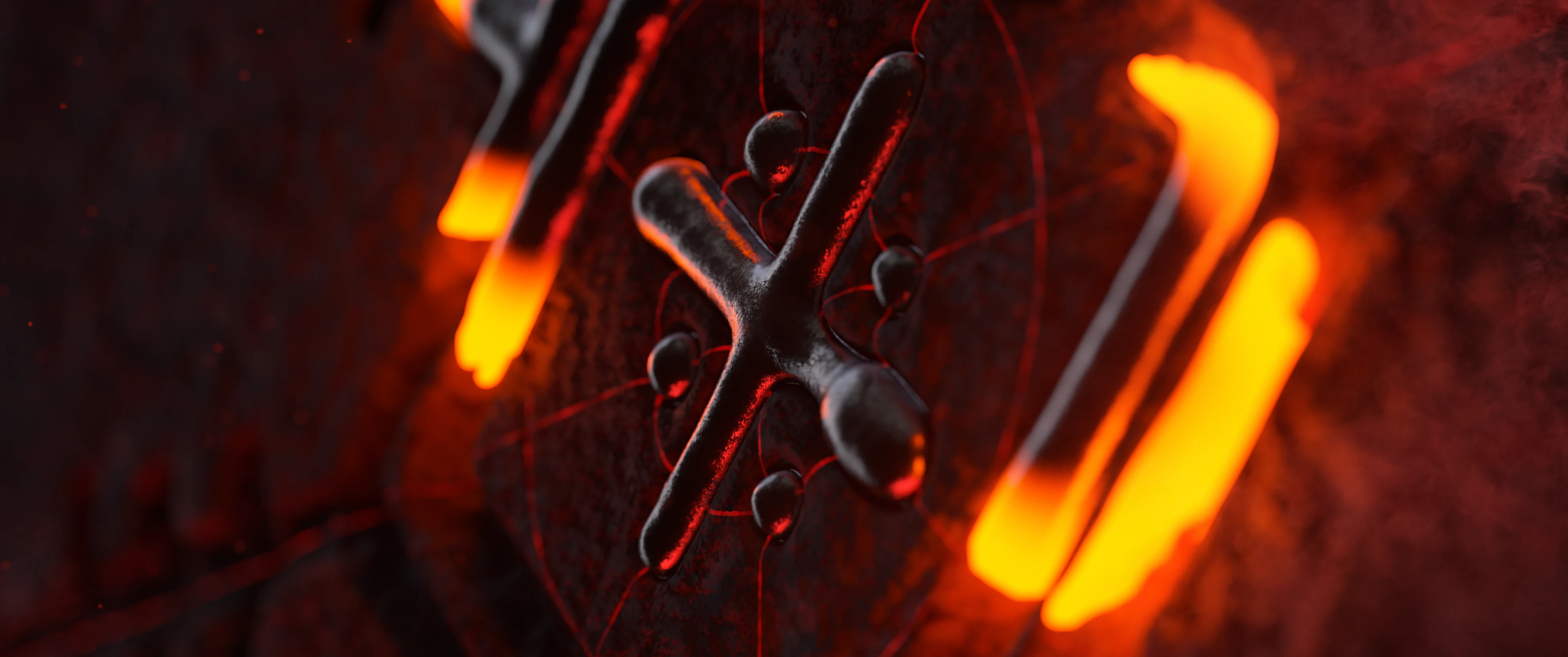
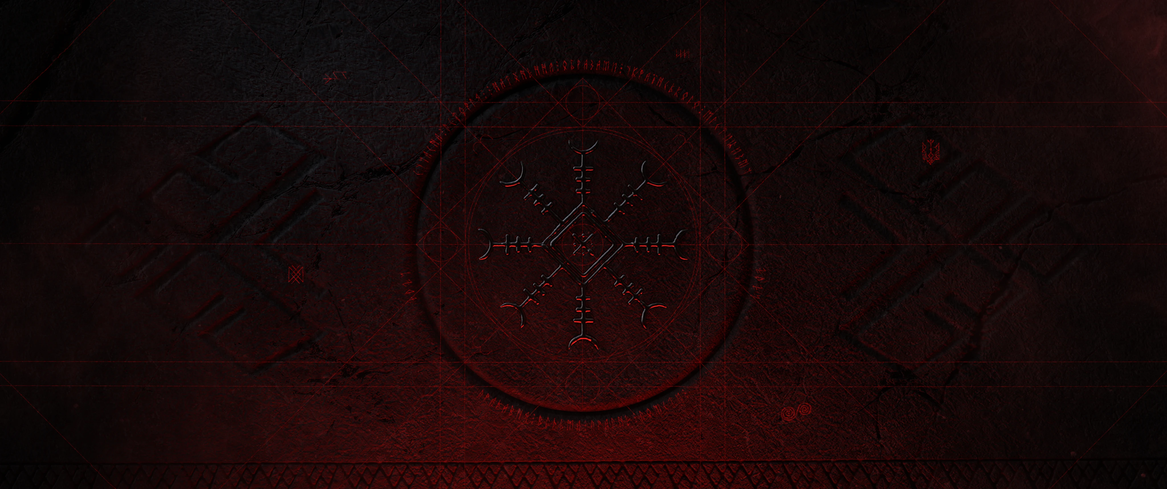
The film’s visual identity was centered around a primary symbolic mark. My task was to reinterpret this static emblem into a cinematic form — giving motion and dimensionality to the Old Slavic-inspired design.
The intention was not only to animate the symbol, but to infuse it with presence and atmosphere, turning it into an active narrative element rather than a decorative graphic.
The original graphic mark was rebuilt in 3D, where I refined its geometry and adjusted proportions to achieve a more dimensional presence.
A complex, multi-layered material setup was created to add surface detail and subtle imperfections, enabling realistic light interaction and enhancing the overall cinematic quality.
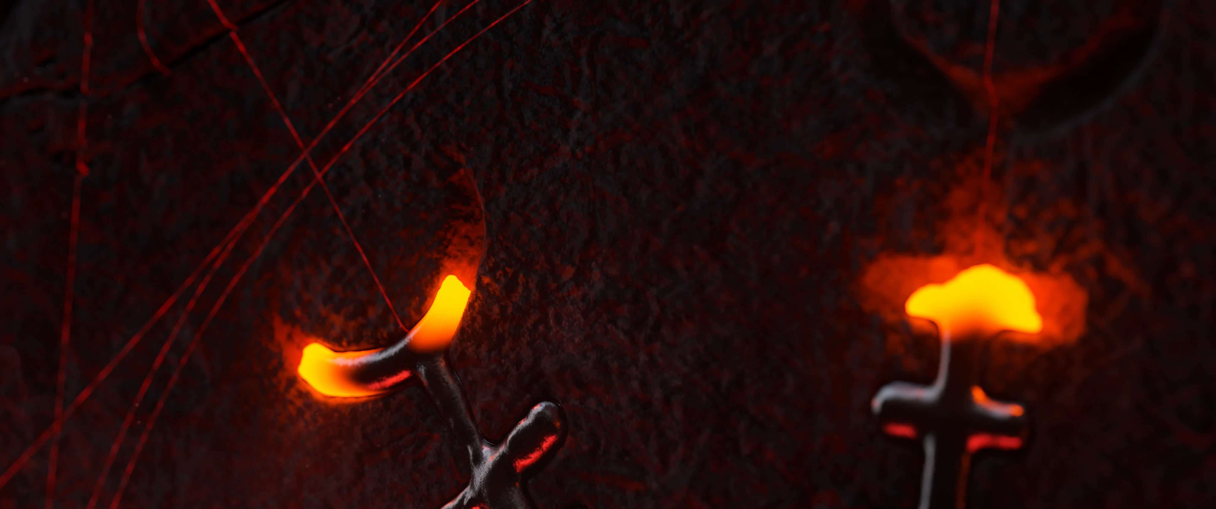
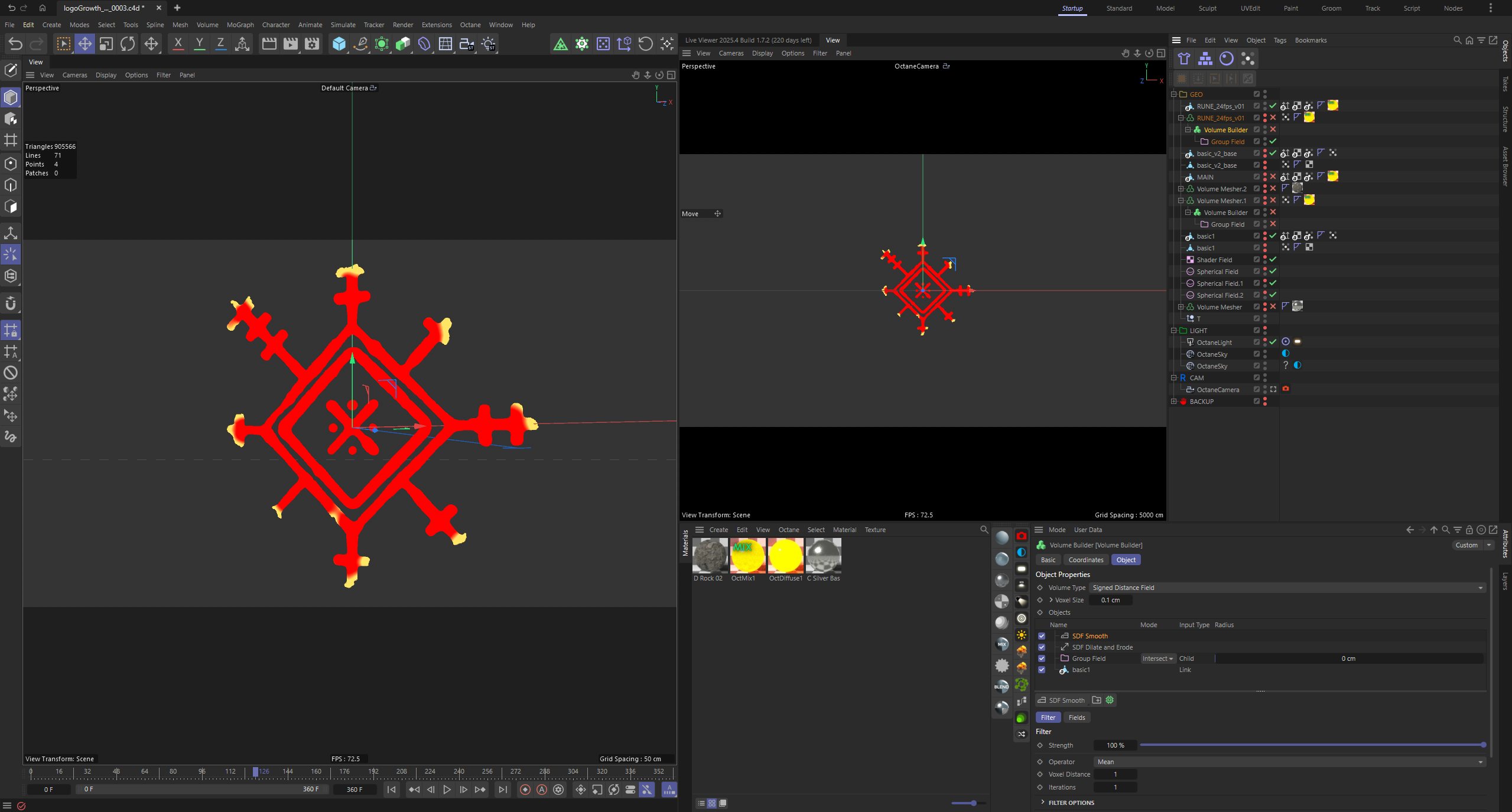
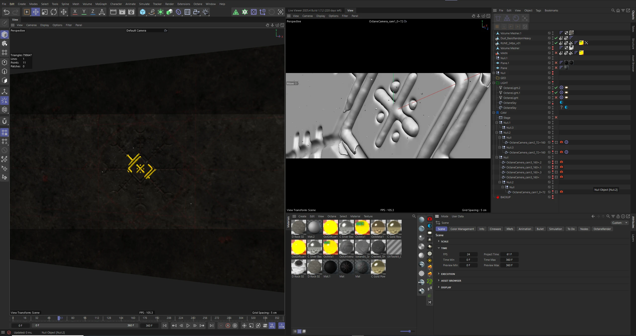
The next stage focused on developing the core animation technique for the symbol. The chosen concept was growth — allowing the mark to emerge organically rather than appear instantly.
A custom VDB growth setup was built using Volume Builder. By combining vertex maps with manually directed animation, I was able to control the progression of the structure in a precise yet dynamic way.
This approach provided both technical flexibility and a more natural, evolving motion language for the symbol.
At this stage, additional graphic elements were designed to enrich the visual complexity of the symbol. Custom lines and rune-inspired details were developed to reinforce the overall aesthetic and deepen the symbolic language.
These elements were carefully integrated to enhance the composition without overwhelming the core structure, adding subtle intricacy while preserving balance and clarity.
The initial concept and creative brief from the director centered around the symbol and its integration into a medallion form. This became the visual anchor of the sequence.
Throughout the development process, I focused on preserving the established stylistic direction while refining the form and materiality to achieve a cohesive and cinematic result. The goal was to respect the original vision while enhancing it through lighting, texture, and atmospheric detailing.
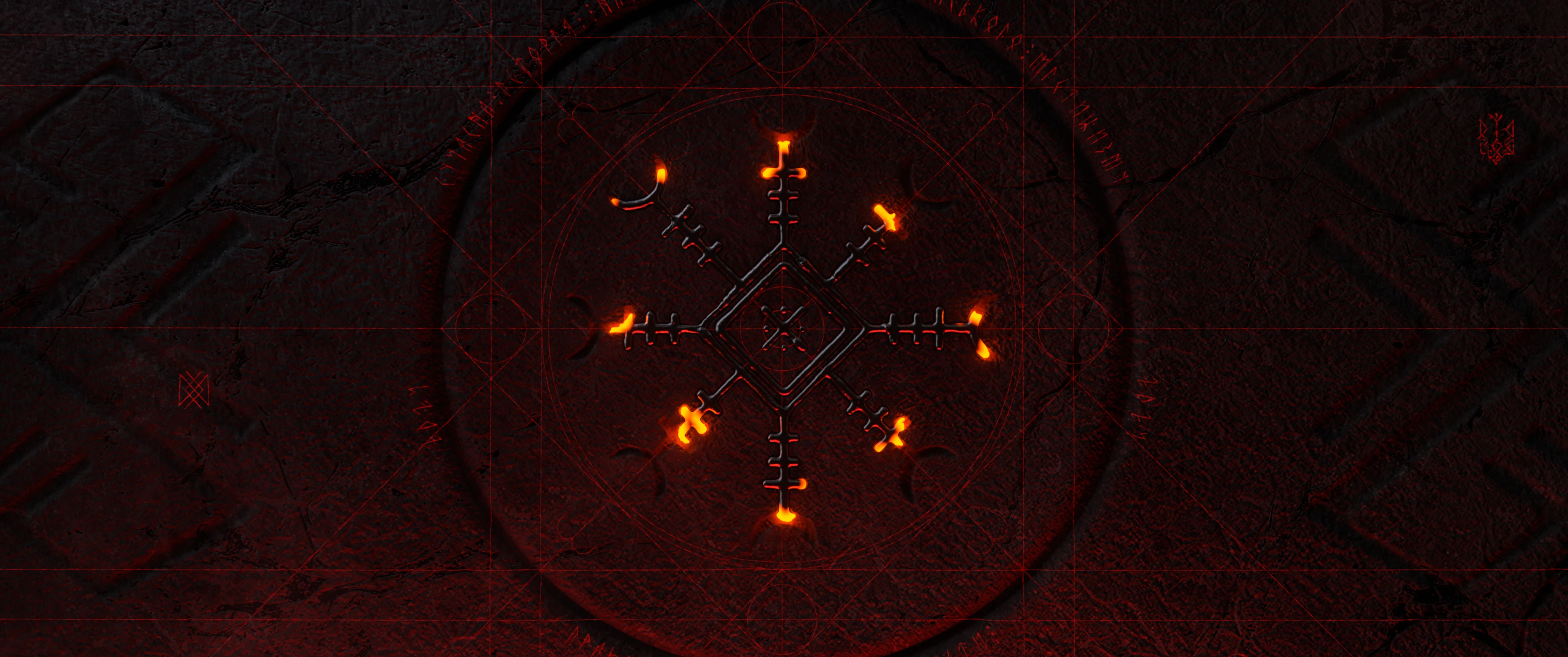
During refinement, we realized that the medallion concept did not deliver the desired visual strength. I suggested shifting toward a rune wall interpretation — a more architectural and atmospheric approach.
This direction allowed both the main and supporting symbols to integrate naturally into the composition, enhancing scale, clarity, and narrative weight. The result was a more balanced and visually compelling solution.
Once the rune wall concept was approved, the focus shifted to refinement and visual testing. The next phase involved exploring camera angles, compositional balance, animation timing, lighting setups, and material adjustments.
The objective was to preserve the original symbolic intent while elevating the cinematic impact. Each iteration aimed to maintain clarity of form and detail, ensuring the symbol remained readable and powerful within the evolving atmosphere.
Through continuous testing and refinement, the sequence reached a visually cohesive and emotionally grounded result.

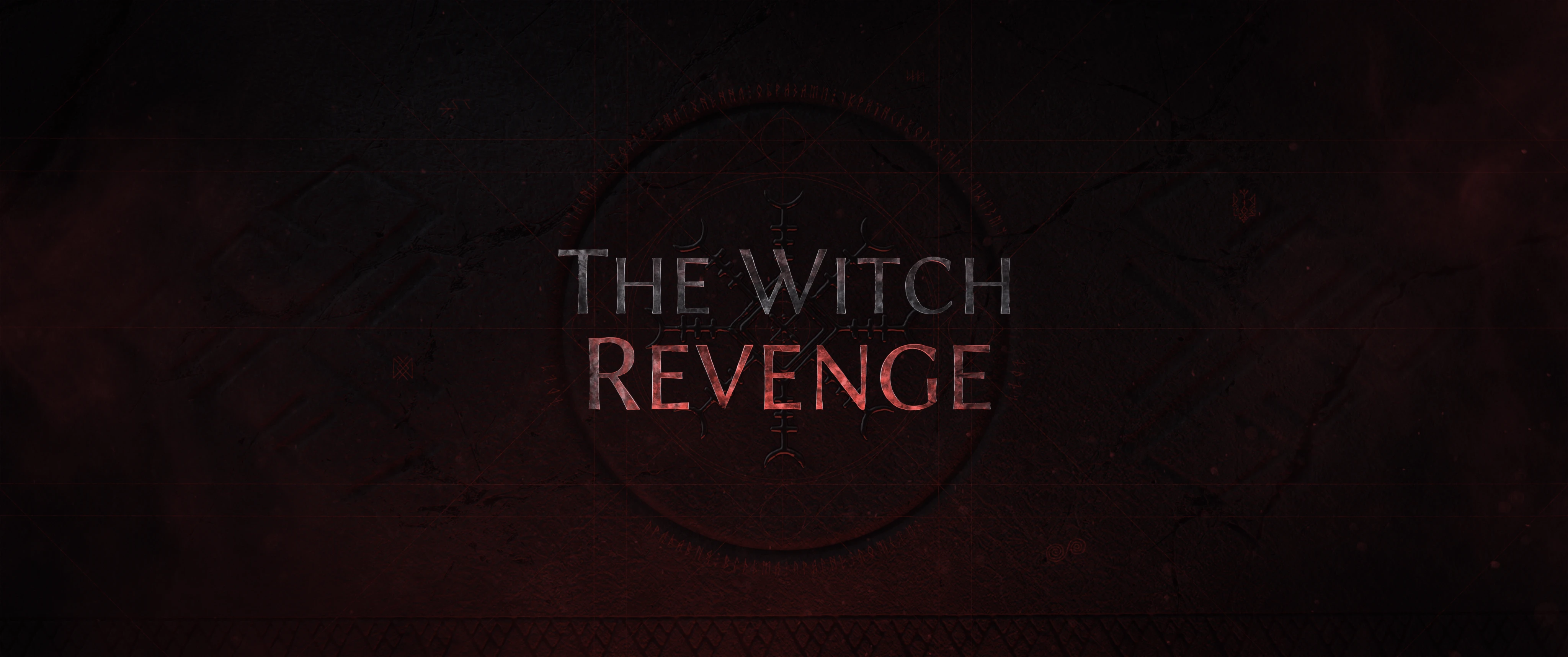
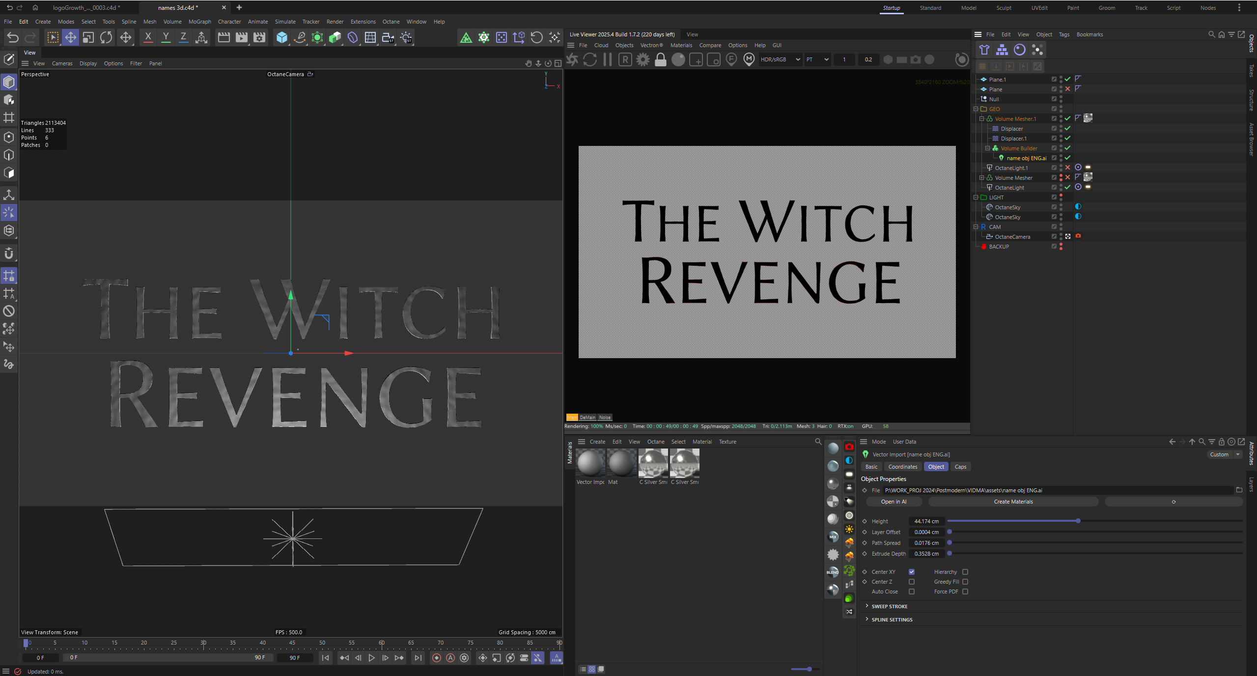
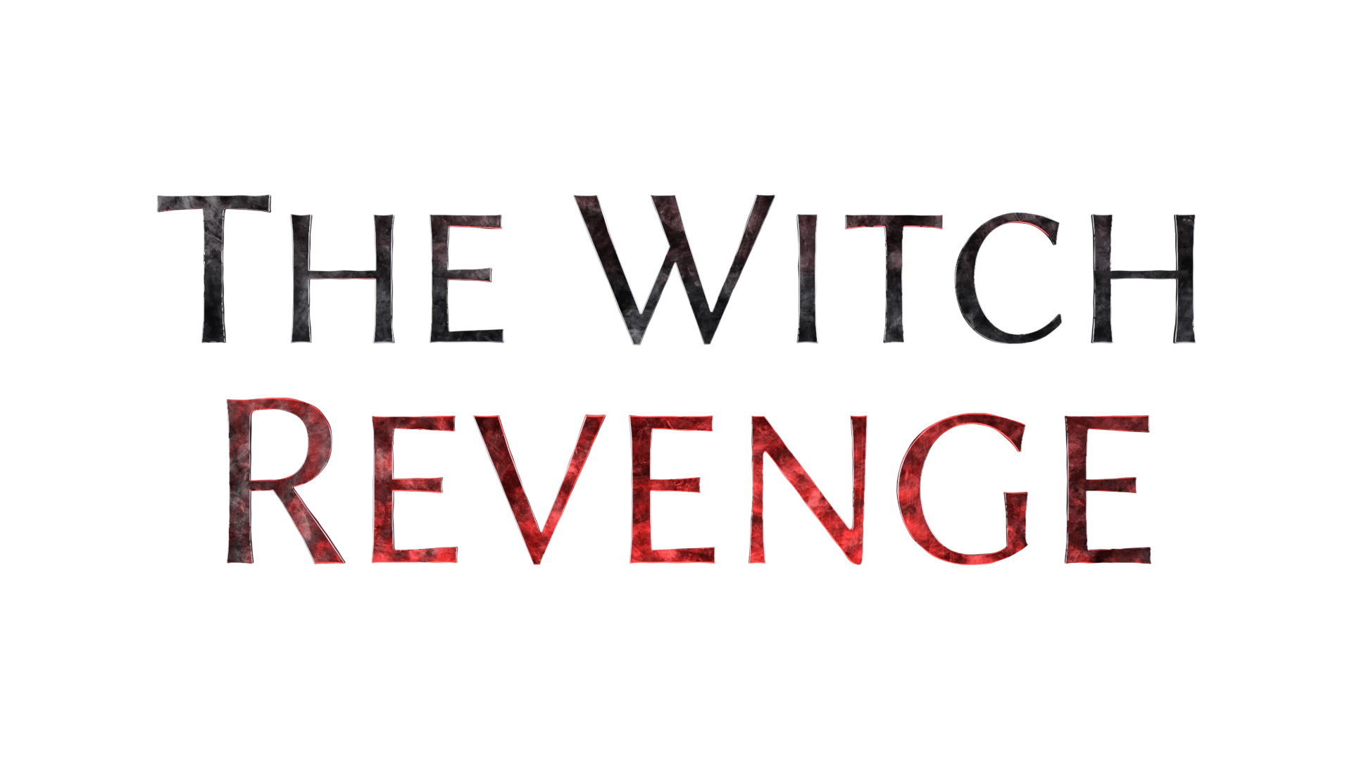
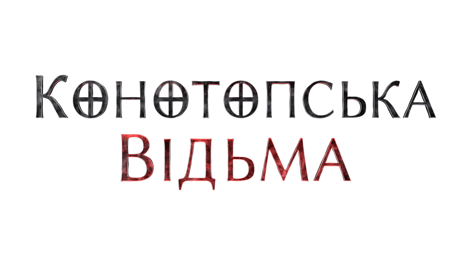
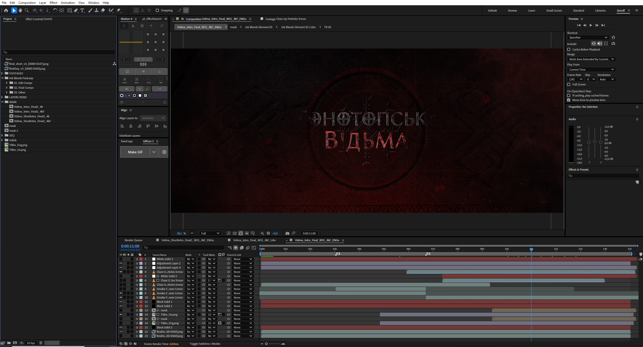
An equally important stage was the development of the main title. The typography was built in 3D to maintain consistency with the established visual language of the symbol and environment.
Both English and Ukrainian versions were created, carefully preserving stylistic coherence, material qualities, and surface detailing. The goal was to ensure the title felt integrated within the same atmospheric world rather than existing as a separate graphic layer.
Through refined lighting and material treatment, the title became a natural extension of the sequence’s visual identity.
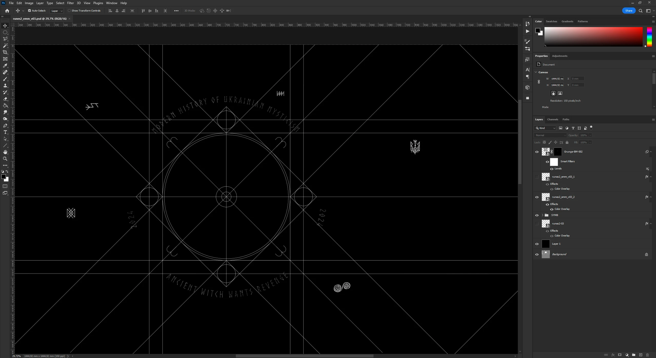
The final stage of the project was completed in After Effects, where the compositing and finishing adjustments were executed.
This included color refinement, atmospheric balancing, glow integration, texture blending, and subtle enhancement passes to unify all visual layers. The goal was to preserve material detail while strengthening contrast, depth, and cinematic tone.
Through careful compositing and grading, the sequence achieved its final visual intensity and cohesive atmosphere.
Official Film Credits
Seeing my name in the official credits, displayed on the big screen, was a defining moment. It marked my first direct contribution to a theatrical film production — an experience that was both demanding and inspiring.
The project challenged me creatively and technically, pushing me to refine my process and elevate the visual execution. Working within a cinematic context added a new dimension to my practice.
This project stands as an important milestone in my professional journey and a meaningful achievement I’m proud to be part of.